When it comes to landing pages, the numbers are skewed. Landing pages do a staggeringly effective job at converting site visitors into paying customers. But directing customers to a standalone landing pages is an underused tactic.
We’ve touched on this concept before: when the numbers don’t add up, it means there’s an opportunity for businesses. Even though landing pages are slowly becoming the standard, implementing them now will still give you a significant edge over at least a few of your competitors. Leveling up your landing pages can improve your conversion rate, which impacts your bottom line. And the best part? You can do it without increasing the number of visitors to your site.
To give businesses an idea of how much of a difference landing pages can make, we found some stats highlighting Why You Need To Level Up Your Landing Pages.
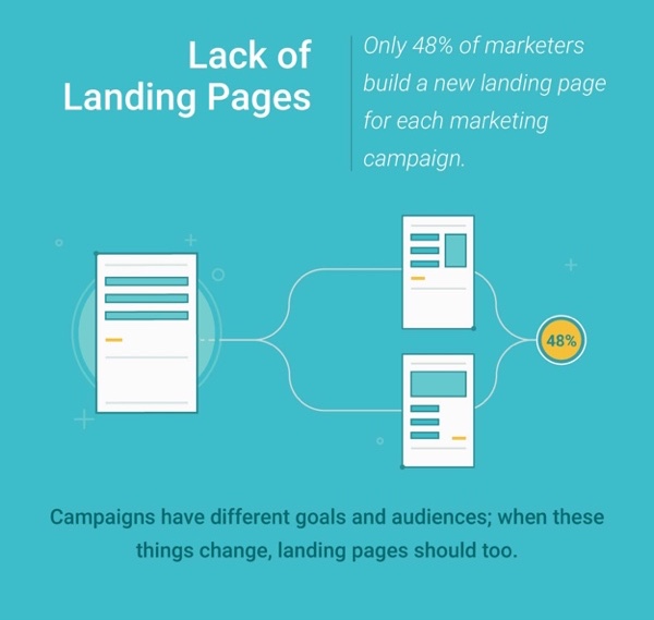
Since you’re looking for information on landing pages, you’ve probably heard using a homepage as a landing page is a bad idea. Unfortunately, most businesses take this to mean they can create one landing page – a home landing page – as a catchall for every campaign they’re running. In fact, 52% of marketers (for shame!) don’t even create a new landing page for different marketing campaigns.
In the same way it’s suboptimal to send every single site visitor to your homepage, it’s a mistake to send email subscribers, social media follows and PPC traffic to the same landing page. Each of these channels has unique methods for getting visitors to click through, and different promises and goals once they do – so why would you send them to the same generic page?
Start embracing the power of landing pages by creating specific pages for each of your various traffic streams. It won’t be long before you experience more success and higher conversion rates!
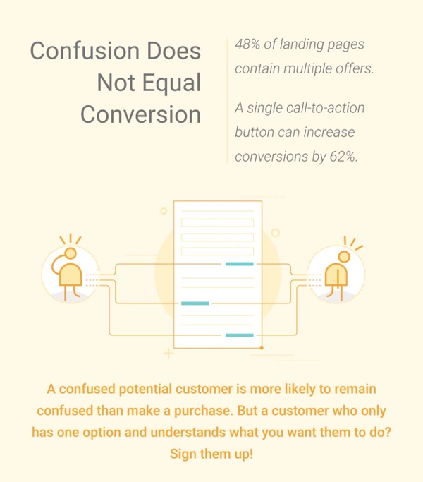
The maxim “less is more” applies to many things – landing pages included. However, the fact that 48% of landing pages contain multiples offers suggests the majority of businesses haven’t yet made the connection. The temptation to cram more than one offer onto the page you know visitors land is strong – but don’t do it. Customers don’t want to be confused or oversold and offering something other than exactly what they’re expecting actually does both. Craft strong, confident offers and trust your landing pages to do their work! Oh and don’t forget to include a call to action as a single call-to-action button can increase conversions by 62%.
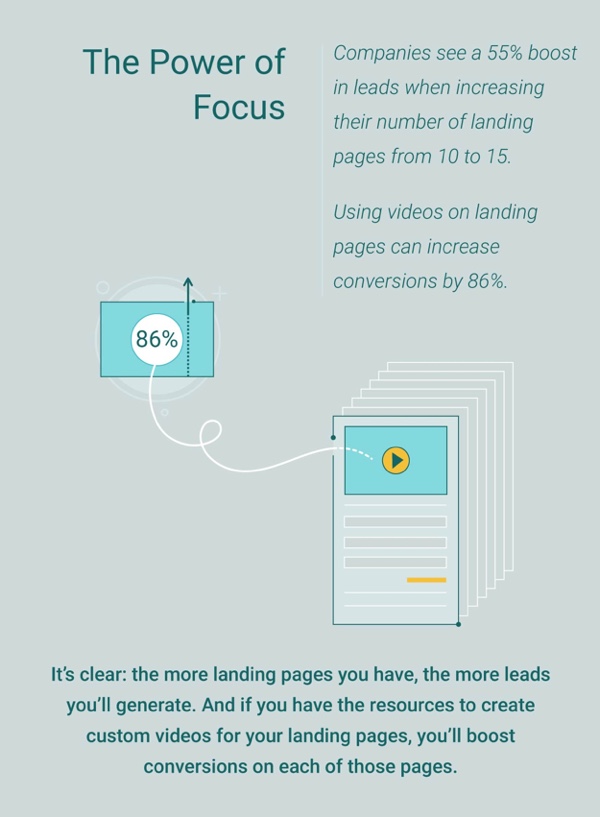
If you have a couple of landing pages and aren’t getting the results you want, don’t give up quite yet. As we’ve discussed, the more you connect the messaging of your landing page to the arriving audience (and the channel they used) the better results you’ll get. If this means creating more landing pages – even different ones for segments of the same audience group – then do it (the stats have your back).
If all else fails, try adding some short explainer videos to your landing pages. Using videos on landing pages can increase conversions by 86% – anything capable of producing results that good is worth a shot!
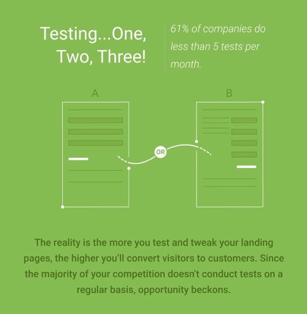
One of the biggest factors that stunts the success of marketing campaigns is not testing vital components like landing pages! The fact is landing pages are where the magic has to happen, so absolutely need to be sure that every aspect of the page is contributing to conversion! You’ve spent the money and dedicated time to funnelling visitors to a certain page with an exact message – but then you don’t test to make sure the headline or call-to-action button isn’t confusing customers?
61% of customer do less than five tests per month on their landing pages; excuse me for saying it again but – this is an opportunity! Test your landing pages components, tweak based on your findings and enjoy the increased conversions with just a little bit of extra work.
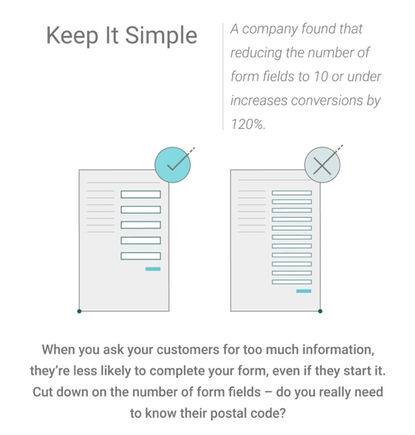
Last but not least, we come to a pretty straightforward fix for an all-too-common landing page mistake: too many form fields. Yes, we live in the Information Age, which means every little detail you can pull from your potential customers can be used to your advantage. But you know what? One or two pieces of information are a lot better than zero, which is what you’ll get if you present customers with a 15-field form!
The proof is in the pudding: a company found that reducing the number of form fields to 10 or under increases conversions by 120%. I’ll go a step further and suggest you keep the number of form fields to less than 5 as I’m a firm believer in keeping things as simple as possible.
———————————————-
That’s it for this infographic summary. Here’s the full infographic, for your sharing pleasure:


